Sunday, 29 March 2015

Week 26 - *Game Art Student after hours


Week 26 - *Game Art Student after hours


So it’s the Easter break and wow is it weird trying to find out how to relax after spending so long doing work on the course. This week I spent preparing visual graphics for my zombie presentation based on pixel art style. 


See I’ve forgotten how to relax. Anyway apart from this, I pretty much spent the entire week just drawing and experimenting with copic markers as seen below.


 The image above is a comic like illustration of my older brother as the green lantern. My older brother has always been a source of inspiration mainly due to the fact that he was the one I remember picking up the pencil and drawing first. Anyway my reasoning behind producing this illustration Comic book artist David Wynne produced an illustration of my older brother with the same subject matter (coincidently I had actually been in contact with in the past during the time I was exploring comic book art as a possible career path).

Wynne's version - The Original

My version of this illustration was my way of proving to myself my growth as an artist as normally I would worry and be shocked in awe of how said artist produced the image above but now after spending so long on the course I feel like I know the processes on how to make something like that and well I’m just so happy about the outcome.


And it seems this hard work paid off, later in the week I got a message from one of my older brother’s friends who works at the independent who saw this illustration and requested I make them one similar. It looks like things are finally looking up and who knows what’s stopping me from pursuing comic book art as an avenue. I really enjoyed making my brothers illustrations plus I love comic books and there’s a comic book artist out there with my name. Guess maybe there can be two Chris Anka’s doing comic book art in the future, just got to keep grinding.


...

A slide show showing my progression of the illustration. 

Chris Anka Web Developer

Morbi aliquam fringilla nisl. Pellentesque eleifend condimentum tellus, vel vulputate tortor malesuada sit amet. Aliquam vel vestibulum metus. Aenean ut mi aucto.

Sunday, 22 March 2015

week 25


Week 25

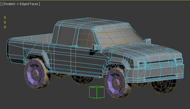
The final week before we break up for Easter. What an eventful week it was. This week my primary focus was to  texture the interior of the car, as well as to get the alphas on my car windows to be transparent. Getting the alphas to work with my car was such a pain. Somehow I came across a weird bug in 3ds max in which my alphas within my viewpoint would work and appear transparent however when rendering the model the whole exterior would be transparent.


Perspective why are you so fun and distracting


This surprisingly enough took me ages to wrap my head around, mostly because at this point after experiencing a bug like this and with no solution found I would often go back and do some 2D perspective sketches.

Eventually the bug sorted itself out as I simply closed and restarted 3DS max.  I don't know how It resolved itself but I really do hope it never comes back to haunt me.

Truck for Hand in

As well as having to deal with alphas mucking up, this week I spent most of my time adjusting the texture of my model. Experimenting with 3ds max's own version the clone stamp tool to stamp out any seems. To which it didn't go well; firstly, the program would crash a lot. It also didn't let you pick what pixels you wanted to use to clone and stamp areas out. Instead it would just mirror textures over which I thought was strange considering its called a clone stamp tool and even has the same icon as the Photoshop one. I even tried to look up how to use the tool but no luck. Seems like I'm just going to have to rely on good old Photoshop in the future.


Texturing continued and I had found that the rust texture I had used on the top of my bonnet and roof of the car was creating this sort of Rorschach look to them creating this weird unwanted symmetrical look to it.


 I attempted to fix this by cloning out the rust and even adjusting the opacity of the rust, however when it just came down to it I realised that the problem lied with my UVS as you can see above. Instead of unwrapping half and using symmetry, I should've unwrapped it whole to make sure I have a larger space to texture and also to prevent obvious symmetry on an area which has a large surface. Funnily enough this is also mentioned in the tutorial they gave us but because I felt as if I knew how to unwrapp and model this by myself I admittedly didn't glance over this tutorial. This will be a mistake in the future I will not make; I will always try to read any tutorials given to us no matter how confident I am in an area.

 Finally, on Tuesday we had a guest lecture from a few developers from natural motion. This was quite an inspiring lecture as we got to see what this company produces as well have a Q and A with the guests.  In addition to this, our guests informed us that the company is looking for internship and it would be possible for us to apply. Personally, I would love to apply however, I do not feel as If I could compete with the older years and the experience they have but I would like to apply as part of a learning experience on how to apply for an art job.

Surprise personal stuff


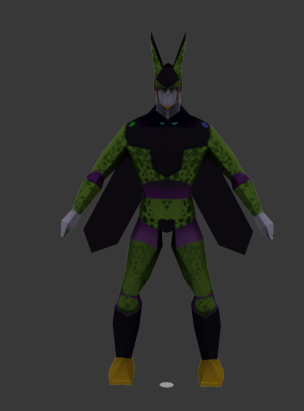
I forgot to post this up last week but last weekend to revise over what I had learnt from the character project I modelled, textured and rigged two low poly characters from orthographics that have already been made.


He needs.... A LOT OF WORK

Chris Anka Web Developer

Morbi aliquam fringilla nisl. Pellentesque eleifend condimentum tellus, vel vulputate tortor malesuada sit amet. Aliquam vel vestibulum metus. Aenean ut mi aucto.

Monday, 16 March 2015

Post Mortem - Character Project


Post Mortem - Character Project


Over the past 7 weeks, we were tasked to concept and produce a character with our own likeness that will fit within the constraints of the village style guide. The character would have to be around 7.5 heads tall that conveys a light-hearted and positive mood. In addition, our character may have some stylisation to its anatomy and clothing such as large chunky shapes. All textures must be hand painted and the Character must be rigged with a bi-ped using no less than 28 and no more than 60 bones. In terms of budget, we were allowed up to 4000 Tris for the characters body and up to 500 Tris for any props or accessories.  Moreover, one of our expected learning outcomes was to produce clean and efficient topology for our characters, which will allow for clean deformation during the rigging and animation stage.

Notes from the drapery session

The project began on week 15. The first week back and we were introduced to an anatomy boot camp, which consisted of a proportions checklist lesson both on body and portrait as well as a brief lesson on drapery. The anatomy boot camp lasted roughly around 3 weeks and by week 18, I started my concepts, which lasted around 2 weeks until I finally delved into modelling texturing and rigging for the rest of the project.


Five things that worked well

Tartan texture
Textures of plaid/tartan clothing - After spending so much time doing research and reiterating upon reiterating I feel as If I managed to create an efficient tartan texture to convey my characters Scottish background. What worked well in particular was the fact that firstly the texture was tile able meaning it didn't create any noticeable seems and Photoshop as a digital medium allowed to me to manipulate the colours via hue and saturation with a clean outlook.

Colours varied in saturation
Colours - The colours of my final model I feel were varied and used natural colours, which convey a friendly and warm look to it as well as the balance of vibrancy and saturation, which allowed colour to not be so aggressive to one's eyes. To some extent, I would argue that it somewhat fits with the style guide, however certain areas and harsh brush strokes need to be refined to fully fit within the guide.


Research and mood boards - I felt like my research was very extensive and detailed and it lead me to find out about cultures, which aren't particular represented within the mainstream media. In addition, from this, by producing these I got to learn about historical cultures and job roles which have now peaked my interest.


Tri count - Normally budgeting Tris has always been something I have struggled with however with this project I made the conscious decision to always cut down on unnecessary geometry after finalising each stage of my model. This allowed me to allocate Tris to my accessories, which I had planned to really sell the role of my character.


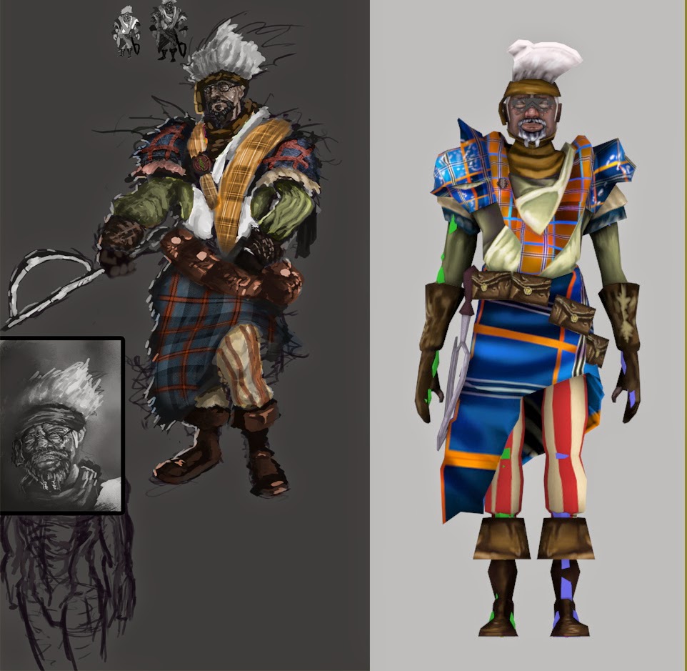
Similarity to final concepts - Compared to my previous projects I do feel as if this is one of the first time I managed to get it as close as I could to my original concept. This may be because after spending all this time on the course I have accumulated skills, which have now allowed to obtain a look similar to the scope of my ideas. During the course of modelling, I felt as if in the most part, I was in control and I didn't run into too many technical issues that I didn't know how to solve.


Five things that didn't go so well


Stylisation and anatomy - One of the challenges I had to face when modelling my character was maintaining a stylised look without ending up with broken or odd anatomy. I believe this did not go so well as I had hoped. There features that I wanted to exaggerate were the hands and feet of my character and model. These possibly weren't the best of features to choose from considering they are the two features I struggle drawing traditionally. This as a result led to the feet of my model to look like Duck like feet in addition to my hands looking like mittens. Looking back I should've really studied what I wanted to exaggerate in more detail so that I have the ability to manipulate them without them look too broken.

Too much details on such simple geometry

Texturing on low poly props and accessories - When texturing my low poly props I think I went into too much detail in painting the textures of the models, more specifically the pouches. I rendered them with such detail including folds and distress however; the model itself is a block square shape. This creates a distracting and cheap looking contrast, which aesthetically does not work very well. When making the texture of my model I had initially planned for the model to have a higher ploy count however due to budgeting reasons I had to take it down which lead to the box look of the final prop. If I had more time I would have adjusted the texture of the pouch to accommodate this.


My rig around the kilt - To the best of my ability I tried to weight and rig the kilt of my model to achieve a clean look however as much as I tried this wasn't the case as there is still some clipping around the legs. If I had more time and practise with rigging I would like to remedy this problem, however I have been told by some of the older years rigging with baggy clothing is quite a difficult task so I shouldn't be so hard on myself.


Colour studies look muddy - When iterating colour variations for the costume of my character I simply blocked colour on top of my chosen value pattern and set the blending mode to overlay. Because I chose very dark midtones to work with this meant that the colours I placed ontop created this really muddy and ugly look to them which caused problems in the future when trying to choose a set of colours to work with.

How it conveys its job role- I feel like if I were to show someone my model and ask them what type of character my model is I feel as if most people will assume that he is a merchant type character due to the pouches of the character. This may be due to the obscurity of the chosen role I selected for my character. Although interesting it isn't a stereotype of medieval history people would associate with.  This all goes back to the idea that the game industry works on visual stereotypes. If I really wanted to emphasise the job role of my character I should've spent more time allocating Tris to my accessories to really sell the job role. On the other hand, if the character was with a barber building, I think that is where my character would work contextually but on his own it suffers from lack of readability.

What project changes happened?

My initial reference for my character

Sketch I produced of my ref 

Before the character project had even officially begun, I had planned to make a blacksmith character based on a pedestrian who I had run into around Leicester. This was of course before we had the official brief and we were tasked with taking pictures of people around Leicester to build a visual library of interesting faces. Initially I had thought that the role of our characters had to be based on the buildings we had produced for the village building project to which mine was the blacksmith.

Ac Brotherhood blacksmith

Visually the outlook of the blacksmith character that I thought at the time was going to be producing would have been similar  to the Blacksmith character from AC Brotherhood. Looking back It was a good thing the brief changed as I would have produced a copy of an already existing character.

Initial concepts

After receiving the final brief and doing some research into medieval job roles the character that I concepted originally was planned to be a Moorish barber surgeon with the intention of reflecting some of my African decent not just in skin tone but in clothing and textures as well in my character.

However, after an initial review I was told I was not meeting the style guide as it turned out. Although not clearly stated in the documents our tutors specifically wanted a European medieval look to the character. Initially I was quite annoyed as I felt I would have to sacrifice the whole "likeness" tone to my character in order to fit the style guide. On the other hand as my tutor explained it "if I were to go in industry and I was tasked with designing a medieval character and I handed them something out of the Arabian knights even if he is historically accurate they would ask me to scrap that character and do it again." This bit of verbal feedback allowed me to contextually understand what It is I am making as well as to understand that one could argue that the game industry works on visual stereotypes to direct and allow users to understand what is what.

This lead me to design a barber surgeon highlander to which looking back I feel is much more visually interesting than my original concept which relied on very mainstream middle eastern stereotypes.

What would you do different

One of the first things I would do differently would be to have better housekeeping of files. On the hand in day, I spent a good couple of minutes trying to sort and arrange files out to make sure my design process made sense when I could've been using this time to adjust rig of my kilt. Moreover I think although the job role I chose was very different I should've chosen something that is quite well known among the public like a medieval doctor, this way avoiding the issue of my character not reflecting their job role so well.

Another thing that I would be mindful of is how anatomy affects stylisation. To elaborate I should've really taken in consideration how ones knowledge of anatomy can separate what makes good stylisation from bad. I decided to stylise areas of the human body, which I am weakest at instead stylising areas, which I feel more confident in. This as a result caused me to seek shortcuts when modelling these areas of the body, which in turn degraded the quality of these places.

In addition, I would change how I would approach making colour variations of a costume for iteration purposes. I am now aware that value can affect the colour which is placed on top and I will be more careful when making these colour iterations so that in the future it's much easier to choose a colour palette to work from.

Finally, one thing I cannot stress enough would be that In the future I should pay more attention to the brief that is set. On the last day of hand in I found out my model was smaller than the brief requirements in terms of CM. I spent the whole day stress and Google searching how to re size a model without it damaging the rig and bi-ped. If it wasn't for the tutors helping me to re scale the scene my character probably would've been the size of an ant when placed in engine.

Conclusion

Overall, this has been one of my favourite and most beneficial projects of the course so far. I have learnt so much in terms of 2d and have refined my skills in 3d as well. In terms of the character itself, I would say it has been a success considering it has been my first attempt at character modelling however there is a lot of room for improvement. Something that I will seek in the coming weeks. 
Chris Anka Web Developer

Morbi aliquam fringilla nisl. Pellentesque eleifend condimentum tellus, vel vulputate tortor malesuada sit amet. Aliquam vel vestibulum metus. Aenean ut mi aucto.

Sunday, 15 March 2015

Week 24


Week 24

This week in terms of working on my truck was very unproductive; again, I started to get caught up in the idea of the amount of time we have to work on this project. 

The truck progress- exterior textured. Chasis and windows need work

On the other hand, I did manage to make a start texturing as well as fully modelling and unwrapping the interior of the car.

Bad car paint jobs which inspired my own

 When it came to texturing my van, I was particularly inspired by some of the quirky and strange body mods and paint jobs I have found on the web whilst exploring reference for my van's zombie variation. 

How I envision the owner of my truck to look like
These car mods gave me an idea I may possibly want to explore in the future with my car; basing its owner on someone who is your stereotypical "Gamer/nerd".

 To elaborate, my idea would be that the car when I get to the zombification stage would belong to someone who I would say has always dreamed of a zombie apocalypse and has even a plan written out.  However, this plan is solely based on the video games and other texts he/she consumes and has a lack of understanding of survival skills.

This sort of quirky and strange cut and shut modifications are what's really pushing my ideas

This would help me push the cut and shut design I discussed in my last post; aim for a sense of deliberate tackiness to convey this trucks owners obliviousness to practical survival skills.

I did however not waste my time completely rather this week I directed my attention to areas I'm weakest at in traditional. I think though looking back this may be my way of procrastination from 3D. At least its productive procrastination right?


Anyway, I started exploring perspective this week via the Scott Robertson book I mentioned in my last post.


It seems to be going well in fact I'm getting  it which is awesome and as a result I feel more confident with drawing as now a lot of the problems I would run into I could somewhat solve with some analysis. Why didn't I study perspective first I never know.

Still life study looking at rendering, value and perspective

In addition, I've gone back to basics and started rendering basic forms such a spheres and cubes to get better at rendering. Pretty late to the party but I found out when rendering forms, render in a way which complements the shape. I vaguely knew this was an apparent tool in art but through the many still life's I produced over the week, this confirmed it.

Light and form tutorial with still lifes
Finally I also took a look at light and form and made a light and form tutorial for myself, however I did try to adjust it to see if I could perhaps make a hand out for others who struggle in this area but I doubt it would be understood to anyone else other than me.

Well that wraps it up for this week. Next week I've got to get the thing fully textured - no excuses.
Chris Anka Web Developer

Morbi aliquam fringilla nisl. Pellentesque eleifend condimentum tellus, vel vulputate tortor malesuada sit amet. Aliquam vel vestibulum metus. Aenean ut mi aucto.

Sunday, 8 March 2015

Week 23


Week 23

One project ends and another begins. This is the final project; the zombie Toyota pickup truck. This is not only our final project but also another big project, which I am excited for, as it will give me some time to push my fundamentals even more. The project has been split in two, 3 weeks to model a Basic Toyota and concept zombie survival mod to it and the rest to model its "zombie slayer" form.

The zombie genre used to be one of my favourite fictional texts however due to so many zombie texts coming out recently; I've been a bit turned off. So initially when met with this brief I wasn't enticed with the utmost enthusiasm.


 On the other hand, what I was excited for was getting a chance at tackling vehicle design and learning how to draw vehicles to which to my disappointment I had found that this would not be formally covered during the course of this project. However, after speaking to one of my tutors about this and telling him about my difficulty when tackling this area he recommended me a book by Scott Robertson named "How to draw cars the hot wheels way". The book itself looks like it is something written for kids however maybe this is just something I need; a book attempting to explain something as complicated as linear perspective and "dumb" it down for younger audiences. I just can't wait to get stuck in.

My truck so far

Back to the project, when attempting this project personally I felt a bit lazy. I know deep in my heart It probably would've taken me 2-3 days to model and unwrap my model, in spite of that I ended spending a whole week on this instead often loosing focus during the model stage. I feel as if maybe it's the fact that we have been given a lot of time such as the other project, or that the fact that this time there is no boot camp and we have just been told to get on with it.   Perhaps it could be just the fact that it's so soon after such an intensive project or maybe all 3. Either way I am disappointed with how I approached this week's work and I really hope to change that the coming weeks.


This week I did manage to develop a moodboard based around what I would want my pickup truck to reflect.  Initially I wanted my vehicle to be a fine tuned death machine; something that you would see out of Mad Max and communicate to audiences that my vehicle belonged to some sort of crew of bandit.  Images such as the ones above really caught my attention as to what I wanted to achieve.


The ultimate cut and shut
However the more I started to research Toyota car mods I came across this awesome creative thing people do with cars called cut and shut. The process describes taking two different cars and merging them together like the one above. Although most of the results end up being hilarious it's something I could really see occurring in an apocalypse in which everything is falling apart and nothing is working. I have to say after seeing this stuff this took my enthusiasm levels way up. This zombie pickup brief has just turned into an episode of scrapheap challenge with a zombie backdrop and I could never be any more excited!


My moodboard so far


Chris Anka Web Developer

Morbi aliquam fringilla nisl. Pellentesque eleifend condimentum tellus, vel vulputate tortor malesuada sit amet. Aliquam vel vestibulum metus. Aenean ut mi aucto.

Sunday, 1 March 2015

week 22


Week 22

So that's it. The character project is over. To my surprise looking back, I've managed to model, texture, rig and apply a simple animation to a character of my own design. From my own personal viewpoint for something to be my first attempt at something, it does not look too bad. 


To me though the outcome of the character project is not what was significant it was all that I had learnt from having the time to spend with such a large-scale project. I feel as if my skills in art have jumped quite exponentially in these last 8 weeks. This I feel was because we were given so much time to focus on one thing and one thing only. This gave me the freedom to do some research into the fundamentals of art, and I have to say I had such an enjoyable experience taking in all this information and starting to see it appear in my work.


...


Over the course of the weeks, I have been refining my skills in anatomy; finally attempting to study and simplify the forearm muscles as well as improving my proportions to my figures. In addition to this through constantly producing digipaints, I started to improve my use of values, working within midtones as well as introducing colour to my pieces. These couple of weeks allowed me to investigate colour and form as well as other illustrative styles such as cel shading. To which one of my cel shaded sketches actually got noticed by one of my favourite youtubers.

This week was also my self-proclaimed rigg week. And what a week it was. I spent each day rigging and re iterating my rigg. Looking back I'm glad I burnt myself out spending that weekend texturing as I wouldn't have had any time to get my rigg to the best of what I wanted it to be. The process itself isn't actually that hard, I just found it way too mathematical and tedious at times which caused me some problems. However once it was done, I was ecstatic at the way this character which I concepted on paper is now moving on a screen. I've never felt a sense of pride such as this one in a long time.


 Finally, we also had reviews by our tutors. My feedback was generally positive, they said that I am passing the first year, which has put so many of my worries to rest however they said something that I was weakest at to my surprise was my anatomy. I managed to achieve inadequate. This piece of feedback shocked me slightly since I spent the past weeks refining my knowledge of human anatomy, however looking back I do feel as if they were referring more to the anatomy of my 3d model rather than my 2d as I do remember them tell me to really observe the different viewpoints. In the future, I should ask more questions when receiving feedback.
 
3rd Years analysis -Very appreciated, however I have noticed that they measured the heads taking in account of the
hair as well which has created some inconsistency - On the other hand points about the legs were
very useful
However, before I handed in the character project I did adjust the anatomy of my model by firstly asking many 2nd and 3rd years for some feedback on the proportions of my model as well as self-reflecting myself.

My analysis

This as an exercise got me to really push my analytical skills and kind of revise over what I had learnt over the past few weeks of the project.


Anyway, the project is finally over. It's been a tough one but bring on the next project I'm excited to see how much I learn from the next one. (Fingers crossed it's a big one)

Chris Anka Web Developer

Morbi aliquam fringilla nisl. Pellentesque eleifend condimentum tellus, vel vulputate tortor malesuada sit amet. Aliquam vel vestibulum metus. Aenean ut mi aucto.